
Hold Up
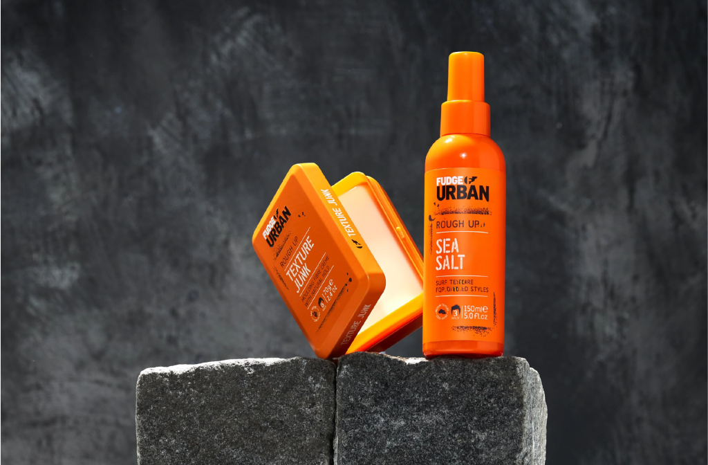
The Fudge Urban team identified an opportunity to maximise the brand’s current popularity in the male market by creating a range of 8 products exclusively for men. There were already two hero products within the existing range – Matte Head and Matte Wax – both in a blue and orange design and in unique and own able packaging formats.
The idea was to create a more uniform, easy to navigate range that is sub categorised into three areas – Matte Up, Roughen Up and Hold Up – retaining the youthful, edgy personality and urban design that would appeal to the target market. Orange was already an important brand equity for both Fudge Professional and Fudge Urban, yet this had been largely lost from the Urban design. It was felt that the new packaging would benefit from the reintroduction of orange across the range, to create a strong, single brand colour and increase shelf presence as well as create a link back to the highly credible brand, Fudge Professional.
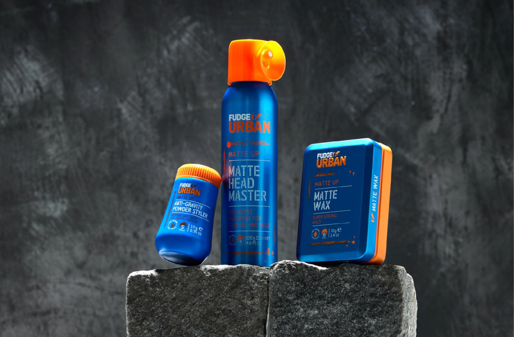
With ‘Urban’ in the name, the range demanded a design to live up to it. We developed a utilitarian, street art-stencil inspired concept that clearly signposted the repositioning of the range. The introduction of icons to communicate hold level and finish kept the design lighthearted and with a sense of humour.
[elementor-template id=”2361″]